Modernity is Safe, but Very Boring
Describing how uninspiring the world has become in the pursuit of simplicity.

Edit I published this before it was ready. Sleep deprivation convinced me I said all that I needed to when really I expounded very little. Anyways, here it is corrected and in its entirity.
"Modernity" is a term I like to use as a blanket description for anything that has been designed in a way to streamline and "update" just about everything. "Everything" literally being just about anything you can think of. It's everywhere and I despise a lot of it.
The world has a current obsession with making all aspects of our life and all the tangible and intangible things efficient. Now, I'm not losing my mind and saying "Anarchy rules, structure be dammed!" Don't worry. We, as a society, need these things - this "optimization" - for society to work and our sanity to remain in good spirits, especially at our current technological state and our vast ever-booming population. This efficiency that we require prevents the unnecessary loss of our most important currency: time. But there's something we fail to notice as the years go by and we continue to enjoy this facade of extra accumulated time like it's the change we get back after paying in cash: everything appears damn near identical as corporations have opted for a boring, streamlined, cost-effective agenda over a fun, creative, and competitive one. You probably haven't noticed it at all or, if you have, it was so brief the thought slipped away from your mind like all the junk mail you toss into the garbage after a mere glance at the front of the envelope.
Take note the next time you go out and about. If you visit a Burger King for a quick treat, go to Taco Bell next. They look damn near identical inside, exceptions being the menu and uniforms the employees don. The buildings are perfectly square, painted the same dreary neutral grey; inside everything is so sleek and spacious, a sterile grey, but we all know it's not due to the sheen of the light on the poorly mopped floors. Go into the gas station and visit the refrigerator. Look at all the sodas, canned and bottled. Most are a very simple color with a very basic logo, excluding specialty Mountain Dew since gamers like RGB and some others that actually need to stand out. There's no inspiration, fun, or effort put into the things we interact with on a daily basis anymore. It's all been sapped away for the sake of being "modern" and being a quicker way for corporations to have their pockets lined for significantly less effort than before.
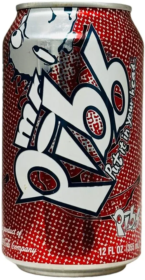
I didn't really notice these things until I had it pointed out to me and it genuinely surprised me. I didn't think anything of it. I was still consuming a Coke or Pepsi without noticing that their branding changed to a strict solid colored can, a simplistic logo, and an uninspired font. For example, in 2008 Pepsi had a bubbled, shadowed font and then in 2014 Pepsi decided to change the logo to a flat, thin lower-cased font and its been that way since. One of my favorite sodas to drink growing up was Mr. Pibb and it was for the dumbest reason: the branding was interesting and eye-catching.

Nowadays, Mr. Pibb doesn't exist anymore and hasn't since the late '90s as it was replaced by its newer sibling Pibb Extreme. Same taste, just less interesting to look at. At the risk of sounding like I'm reminiscing like a boomer would about "The good ole days", things before the 2010's were actually interesting.
I guess you could say this is a bit of a nostalgic vent. I do miss the things I grew up with like the adobe-like building for Taco Bell and its stupid Chihuahua mascot, or the iconic red roof found on Pizza Hut's that had that awesome, comfortable, family-dining like atmosphere on the inside. But my point is everything used to have a uniqueness about them; now everything is the same.


